V Stock has had a terrific swing higher since Nov 25 when the stock closed at $89.02. Throughout this move up I have stayed with a put selling strategy of staying about 10% out of the money with the put strikes I sell against V Stock. Today, Dec 28, V stock dipped closing at $100.72. I sold puts on V Stock, picking the Jan $92.50 put strike and selling puts for .55 cents. While the chart on V Stock looks good I prefer to stay about 10% away from the present V Stock selling price. To do this I have sold puts on the dips in the stock.
I have received a lot of emails from readers who have sold V Stock put strikes close to or at the money and wondering why I am staying so far out of the money for smaller premiums when V Stock appears to be in a long uptrend. I explain my present V Stock strategy below.
V Stock Chart
Since June when V stock was at $90.00, it has risen over 14%. In the chart below I have indicated in the red circles the periods when I have sold puts. Basically I sold puts on every dip in V stock. As well, I also was assigned shares of V Stock at $82.50 on August 19 and sold them on August 29.

The problem with stocks that are climbing is knowing when they are going to fall. Stocks fall further and faster than they climb. Selling close to or at the money puts any rising stock including V Stock, I believe is a mistake.
When stocks like V Stock are in an uptrend, professional traders move into the stock and push it higher. This is what is happening with V Stock. As the stock climbs, unsuspecting retail investors buy the stock as it hits new highs. The strategy may work for a while but retail investors have a history of not selling at the opportune time in a stock. V Stock I believe is no different. Retail investors continue to buy the stock on every new high instead of buying the stock on dips and unloading it on new highs, then waiting for V Stock to dip again.
Professional traders are adept at this game. They buy on weakness and unload their shares when the uptrend in the stock fades.
When Puts Are Sold
When puts are sold, the strategy is for the put to lose value as it reaches expiration. This takes time. If I sell a put in November for December, there is chance that the stock could begin its decline BEFORE the put not only expires, but before it loses much value.
If I have to close the put for more than I earned then I am looking at a loss. If I buy back the put and roll lower, I could be rolling my puts down on a stock that is beginning a serious decline.
The answer for me has always been to sell puts out of the money, normally about 10% which allows more opportunity for the put trade to work in my favor even if the stock begins a decline. While selling puts that far out of the money earns a lot less than at the money puts, I use a strategy of selling puts on the dips, buying them back as premium evaporates and doubling up on my capital so I can sell puts at a variety of strikes and a consider two months out for some capital and one month for the rest.
For example if you look at the V Stock trades for November and December 2011 you can see that in November I sold puts both for December and January. In December I sold puts for both January and February.
Selling puts on rising stocks can be very profitable but the secret is knowing when the stock is about to decline and either not sell puts at that point OR buy to close any sold puts to save yourself from having to buy back the puts for large losses or worse, be assigned shares at the top of an uptrend.
V Stock – Spot The Warning Signs
There are warnings signs an investor can spot on a rising stock such as V Stock if they are using the right tools. One of the easiest is to use the 13 week and 26 week exponential moving average along with the MACD Histogram. Select this V Stock link to read more about Histograms. As well you can also use my early warning tools to spot a collapsing stock. However those tools are designed more for a stock that is in a serious decline. I like using the MACD Histogram combined with the 13 and 26 week EMA for rising stocks to spot weakness and what could be a dip. If I expect the stock dip is going to be more serious than I turn to my early warning tools, such as I did with YUM stock when it fell 7% on Sep 29 2011. You can read that YUM Stock article here.
13 and 26 WEEK EMA and MACD HISTOGRAM
EMA and MACD Histogram Setting
It is important to use the same settings for both the EMA and the MACD Histogram. I like the 13 week and 26 week EMA, but investors choose many difference settings including the 10 and 20 day or week moving averages as well as the 5 day and 10 day when they are looking at the stock chart for just a two-week period.
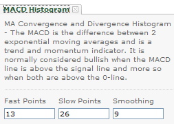
Below are my MACD Histogram settings.

AMZN STOCK
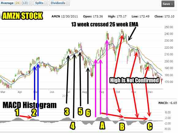
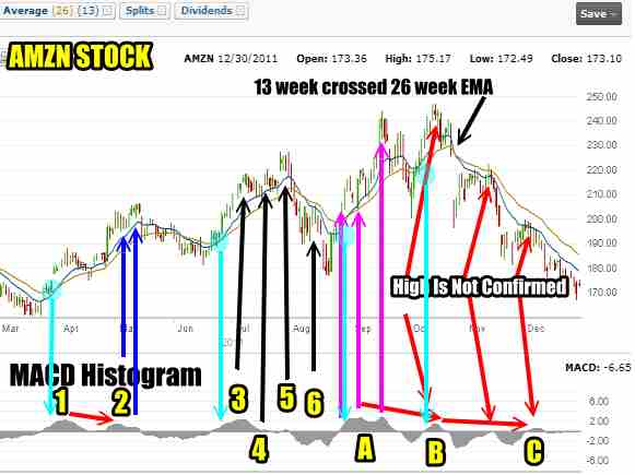
Let’s look at Amazon Stock to study these warning signs. The 13 week EMA is blue and the 26 week is light green in the chart below.. When the 13 week crosses over the 26 week it is indicating which direction AMZN stock is going to move. For example in October 2011 you can see where I have marked the 13 week crossed the 26 week EMA which gave a solid bear signal to AMZN Stock. I use the 13 and 26 week EMA to confirm the MACD histogram, but the EMA crossover is slower than the Histogram at signalling a warning.
To understand further, review the chart with the legend below.

#1 MACD Histogram in April indicated that the move up in Amazon stock is being supported by solid buying.
#2 MACD Histogram in May is lower than #1. This indicates that the move higher in Amazon Stock is not being confirmed by solid buying. Look at the blue arrows and you can see that as the stock climbed, the histogram moves even lower.
Therefore in #2 as the stock rises, professional traders are fading this stock by quietly unloading stock positions because it is obvious that the stock has a good chance of falling lower where they will re-assess to decide whether to re-purchase positions. Over the next few weeks AMZN stock did fall confirming the MACD histogram and indeed part way through Jun 2011, the 13 week crossed the 26 week EMA signalling stock down. But for professional traders the EMA on its own is too slow to react. By the time the EMA gave the sell warning Amazon Stock has already fallen and indeed appears to have stabilized. The real key for professionals was #2 which should have been higher than #1 if the stock was indeed going to move higher. It didn’t and they sell at the top of the rally (#2).
After the fall in AMZN Stock, the histogram pulls back then begins to turn back up. The professional traders buy the stock while the retail investors are dumping their stock, concerned with the large decline which was over 11%.
#3 shows a nice smart move up in AMZN stock. This move marked by #3 is higher than #1 confirming the uptrend.
The #3 rise in the stock is followed by a shallow pullback and then the stock moves up another 6%, but the 6% rise is not confirmed by the MACD Histogram. I have marked the upswing #4 and #5. The histogram refuses to rise but warns that the move higher following #3 will not hold. For professional traders this is a non-confirmation and by #5 they will be unloading their positions in Amazon Stock again. Note how the 13 and 26 week EMA is slow to warn that the rise is weakening.
The stock falls after #5 and then has a slight rally which I have marked #6. Again the MACD histogram is does not confirm the bounce up. At this point professional traders are already out of stock at the last top in the stock. Following #6 Amazon stock fell lower and remaining retail investors are shaken out of the stock. The decline from #5 to the bottom in mid-August 2011 was 22%.
This 22% decline is felt keenly by retail investors as many would have bought at the recent top (#5). They take losses and get out. The professional traders though are watching the histogram and they can see by A that the Histogram is again positive and they are buying shares again.
A shows that the next big move up in Amazon stock is confirmed by the MACD Histogram. From the low in mid-August the stock rises $67.00 to a high of $244.00 for a 37% rise! But as the stock rises, look at the histogram marked A and you can see the fade in the rally as the stock rises. After 37% many professional traders will already be out of the stock as the histogram SHOULD have increased in size if the rally was going to move higher. Instead it shrank with the climb. Meanwhile though many retail investors would have once again bought near the top.
From this point on you can see from the histogram where I have marked B and C that the bounce back in amazon stock is not confirmed. The rise marked B is lower than A and C is even lower than B. Professional traders would not be in the stock but instead by the end of December with the Amazon stock down 32% from its most recent new high of $246 set in mid-October 2011, you can be sure professional traders are watching the MACD histogram waiting patiently for signs to get back into the stock.
While the 13 week and 26 week EMA can be used for trading in and out of the stock and as a warning sign, look at how throughout the year, the MACD Histogram has been an excellent early warning tool flashes both buy and sell signals to professional traders long before the 13 and 26 week EMA.
Put Selling With The Histogram
For Put Selling, the obvious choice is when the stock is rising strongly. I have marked these in light blue with a circle on the stock where I would consider selling puts and the arrow pointing to the MACD Histogram. Note how there have been NO put selling indications since early October.

These tools can also be used to buy puts and calls, although that is not my strategy or interest. By selling puts out of the money as the stock rises, I am assured that if the stock turns suddenly and the MACD Histogram reading is wrong I have time to buy to close my sold puts for little or no loss and then wait for another signal from the MACD Histogram.
No Point In Waiting For The “Perfect” Reading
Remember that experienced investors know that there will be times when the MACD Histogram and 13, 26 Week EMA s wrong and the position has to be closed quickly to reduce any losses. Experienced investors dol not wait for the “perfect” signal because by the time that appears the best position will have already passed. But for put selling I can wait a bit longer to get more confirmations since I want the move back up to be strong enough to support the stock and allow my puts to either expire or see the premium evaporate which allows me to buy back my sold puts for pennies.
What The MACD Histogram Strategy Is Saying About V Stock
Let’s apply the same strategy to V Stock and see what it is telling us as investors.

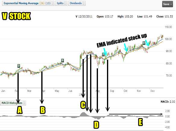
V Stock chart for 2011 Showing The MACD Histogram and 13 and 26 weekly EMA
I have marked the 13 and 26 week EMA strategy for the past 6 months and you can see the V Stock Up calls by that strategy. Adding the MACD histogram provides us with more information about the uptrend in V Stock.
A indicates that the V Stock rally has solid buying. Note how the V Stock selling after A was shallow and then another move higher which I have marked B. B is just slightly higher than A so there is again solid buying of V Stock shares. Note how after B, V stock continued to climb HOWEVER the histogram did not support any move higher in V Stock. At the same time selling in V Stock was muted. The next V Stock rally higher is marked with C. This was the biggest point of V stock buying this year. After the initial rise in V stock, the MACD Histogram pulls back showing that the V Stock rally is fading and eventually by D, V Stock has pulled back. Look how the selling in V Stock which was strong, lasted only for a short time and then became muted again.
I have marked the Sep to Dec 2011 of V Stock as E. Note how V Stock has climbed higher and higher yet the MACD histogram shows that selling in V Stock was slight while buying was consistent but not stronger. If buying was stronger as V Stock rose the histogram would be higher with each move up in V Stock. This is not the case. The black arrow above E shows that each rise in the histogram is the same as the previous. It has never gone higher or lower, but the same. This means there is continual strength in V Stock and obviously professional traders believe V Stock is going higher, marked by their reluctance to sell between September to December 2011.
This is excellent for my V Stock put selling strategy. I can continue to sell puts on dips in V stock, with and check the MACD Histogram for warnings signs of a change in trend.
V Stock and MACD Histogram Strategy Summary
While many investors doubt the ability of technical analysis to aid them with their investing, it is obvious that the above strategy is of significant value whether doing put selling on stocks like V Stock or day or swing trading with the stock itself. Most investors fail with technical analysis because they do not use the strategy daily and consistently. Technical readings must be studied daily and should be plotted out both over a 1 year period, 3 month period and even a weekly period and often changing the MACD Histogram settings will give a better clue for shorter durations about what may be happening in V Stock.
This strategy provides me with a high level of comfort when selling puts on rising stocks like V Stock. Through consistently using this strategy I can take advantage of rising stocks like V Stock to add easy profits to my portfolio and enjoy an early warning system that protects my put selling strategy from losses. By combining the above strategy with selling far out of the money V Stock puts, I allow myself enough protection to close my position quickly with no losses when the MACD Histogram warns that the rise in V Stock is ending.

